Using Jekyll Picture Tag
By Luke O Published 2023-09-13 tutorial JPT
To handle images in a reactive manner, this theme uses Jekyll Picture Tag. JPT automatically creates a set of resized images from the source image and inserts them as a picture tag source set. This theme has a few presets for this plugin to allow for a basic setup without fiddling.
The default profile is called when using JPT as normal. JPT is called using the Liquid tag function picture to call pictures stored in the assets/img/fullsize (this is folder can be changed). For example on this page the tag picture squirrel.jpg displays the below image.

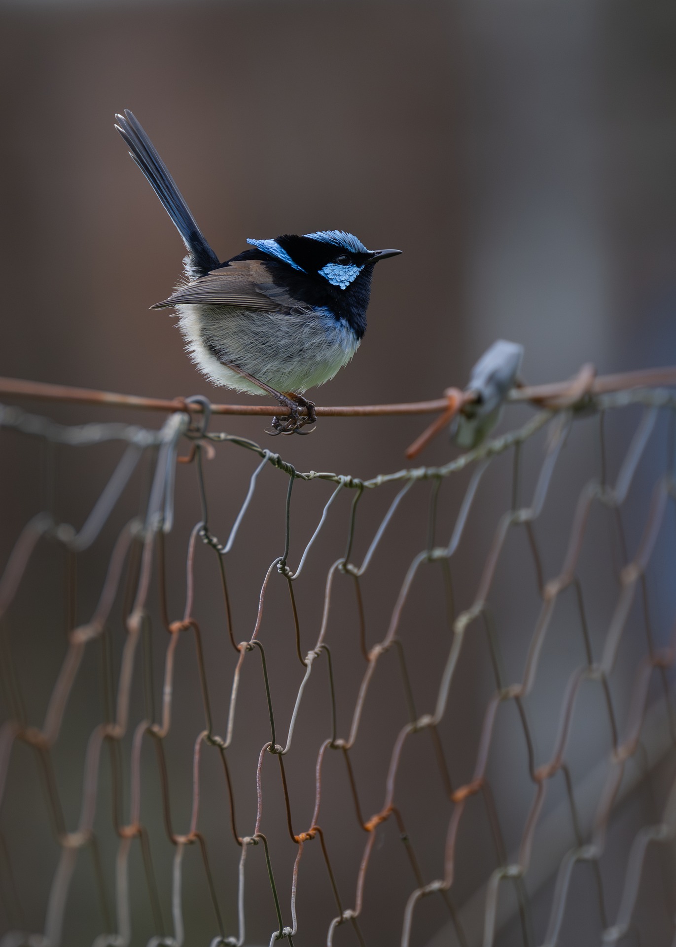
This tag can take a preset before the image source that can be used to change the way JPT handles the image. For example, the header image of this post uses the preset postheader which crops it to and appropriate aspect ratio and handles it as part of html instead of markdown. So the tag picture postheader superb-fairywren.jpg gives the header image at the top of the page. The cropping is set to the focus of the image by default, which you can see in practice by clicking on the image to see the original. If you want to write your own presets make a copy of the picture.yml from the theme to keep the preset used for the layouts.
If at the end of the tag you can append a crop ratio, and optional keep setting, to easily make a custom crop. The various settings can be found here. For example the tag picture squirrel.jpg 1:1 centre give the image below
where as picture squirrel.jpg 1:1 attention gives
Now why bother with all this? Well modern websites are viewed on many different types of devices which don’t need the same fiddelity of image as a full size desktop. Trying to load desktop size images onto a mobile device is waste of bandwidth for a device of already limited bandwidth. Picture tags take into account the size of the requesting device and limit the html request to the appropriately size, making your site load faster and be placed higher in Google searches.